Author Archives: alicebouttell

Forgotten corners and the unfinished. Layers and textures in wasted spaces.

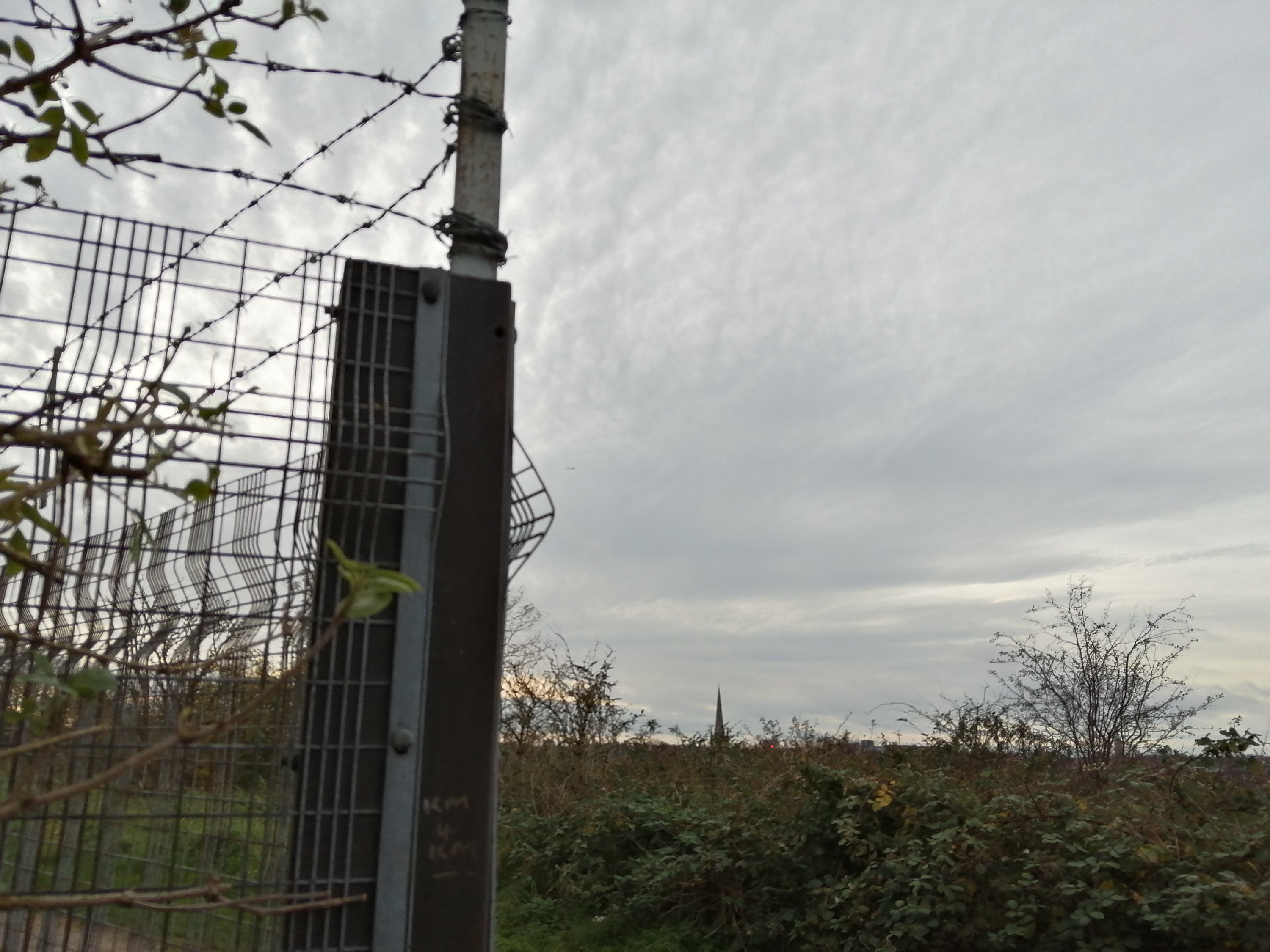
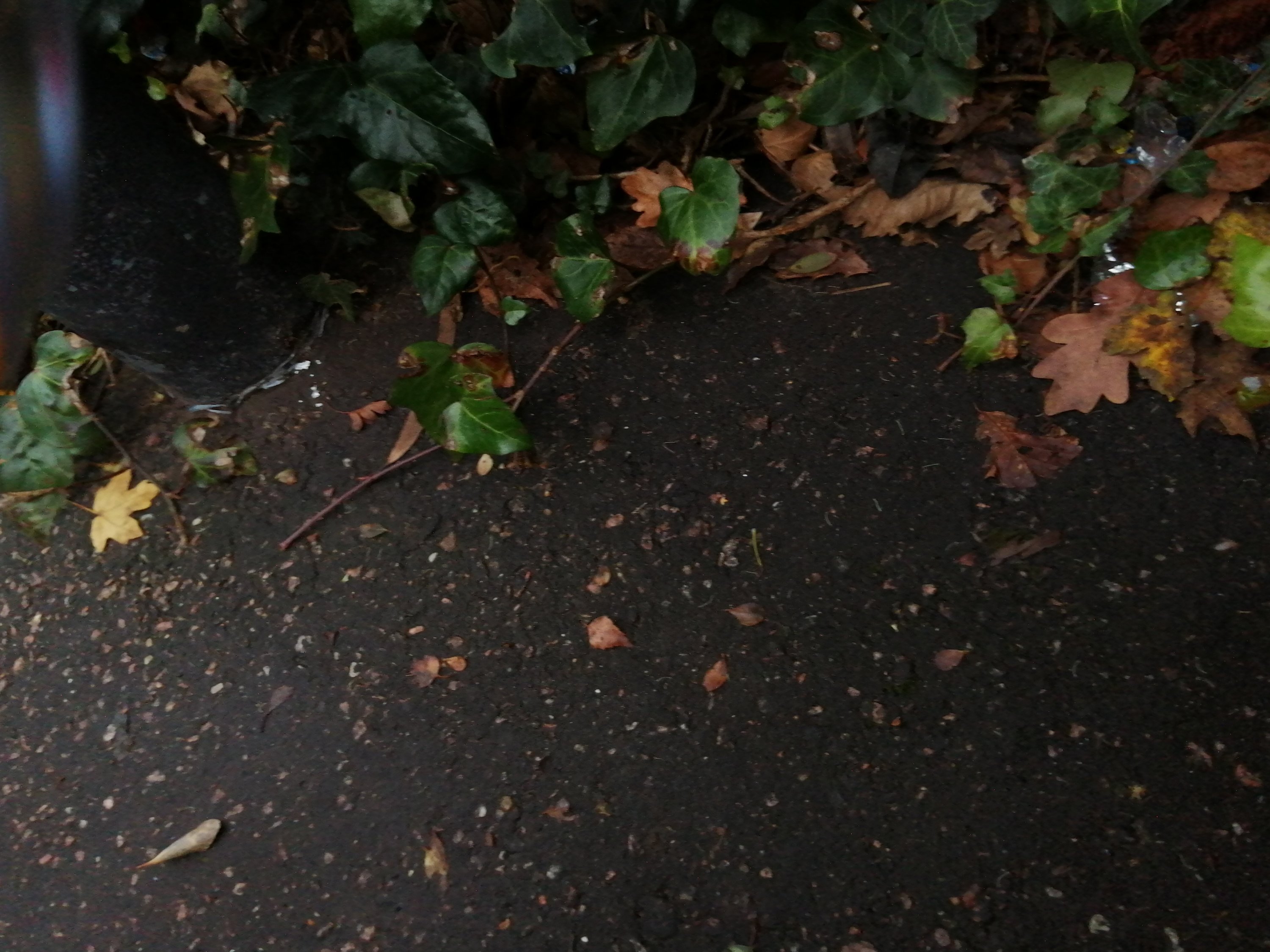
I’ve been exploring the neighbourhood in more depth with my children, specifically looking for overlooked corners, alleyways and paths that lead nowhere in particular. Through doing this I’ve discovered forgotten, neglected spaces with unfinished activities. There are intriguing layers and layers of clues where humans have been. A mix of man-made and natural materials, tangled and interwoven, abandoned buildings where a business has failed, gaps in fences to overgrown gardens, plastic mesh rolled up and left to disintegrate while dandelions push through concrete and grass that hides sheets of rotting plywood.

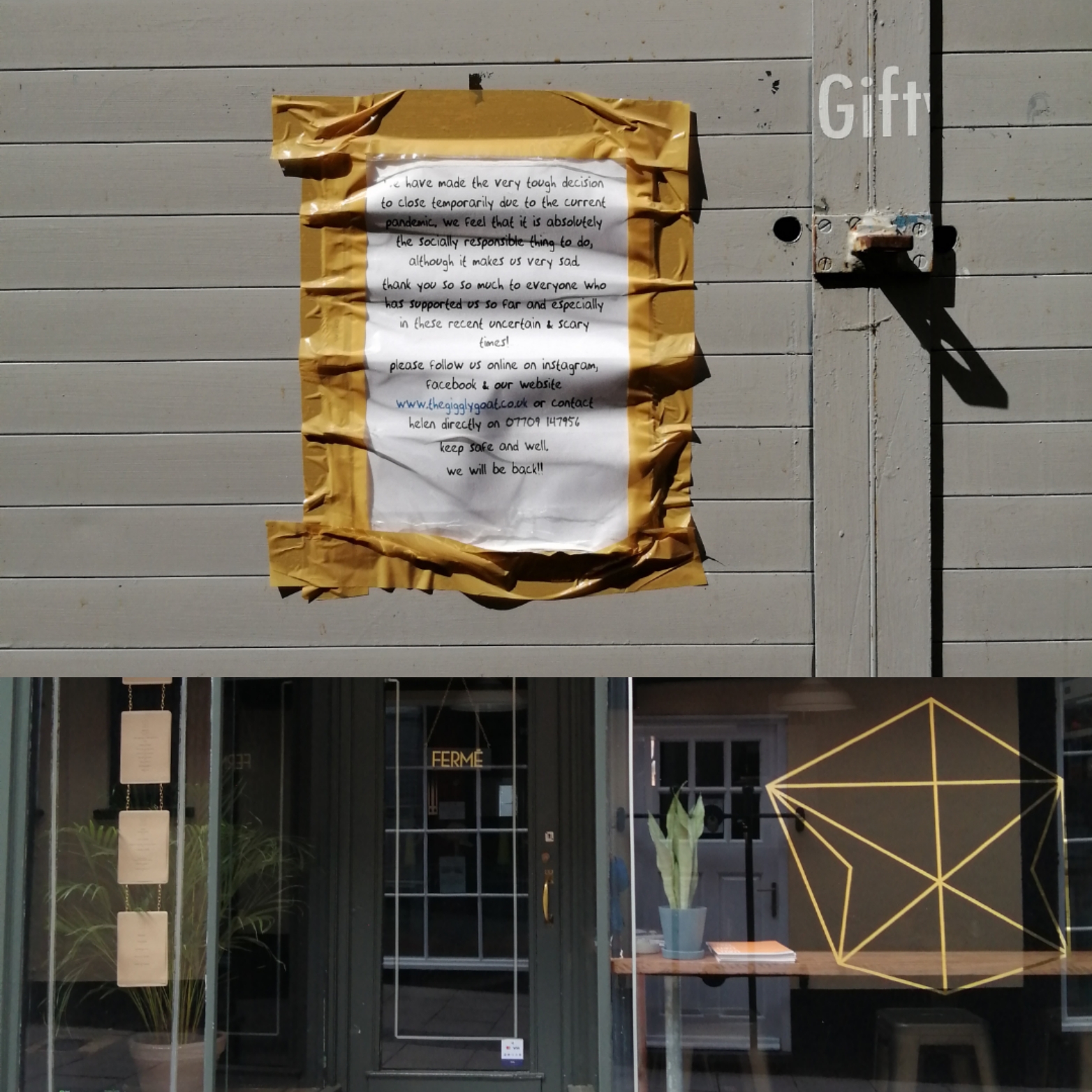
In and around my neighbourhood there is evidently a dissonance of community and underground reprobation. The local park is frequently searched by sniffer dogs and there are narrow paths that lead towards hidden spaces where dodgy goings on occur. Either sides of all walkways on the brambled hill are sprinkled with rubbish. There are people around, myself included, who voluntarily litter pick in an attempt to maintain a space that’s safe to roam around and pleasant to be in. Reminders of how the system fails many people in the UK are all around us. How our national government forces local councils to chip away at the resources that should tackle social issues all whilst barely maintaining public spaces. Empty buildings and unused car parks, places that hold so much potential, now stand forbidden for use because of inefficient red tape and doomed to decay.

I love the dichotomy of the orderly man made with the sprawling natural. How winter has stripped the trees and shrubs of their leaves to expose their delicate line structures. There is a corridor made by a chain link fence and a privet hedge, a garden fence that’s a made using disconnected materials, serving the purpose of a barrier without the luxury of aesthetic appeal. The sign has been taken from the old factory shop probably as a memento, leaving behind an X mark of the glue which once held it in place. Redundant signs are reclaimed for graffiti tagging. Plastic pipes are cut to ground level and left to collect rain water.

Applique paper collage

I’m moving the collage theme into applique territory. Something usually done with cloth but I like the brittle quality of paper and how it behaves when stitched. It’s is also more stiff and rigid, making stitching pieces together more quick.

I’ve also attempted to give these abstract images a bit of meaning by naming them. I think it can guide the viewer to look at it beyond random looking shapes.

Some of the paper used came from mucking about with my kids. The quality of mark making is nicely fluid and ad hoc.

Spearhead. Crayon, felt tip, paper, thread and sequin
Mountain and Lake
Ripple
Ripple 2

City Messages in Lockdown

On the subject of collages, here’s a few I made from photos of shops and businesses with covid related notices in their windows around the city of Norwich, where I live.

I find it interesting how the notices indicate the various approaches people have had in dealing with the pandemic, ultimately leading to lockdown. Not all shops were shut.

Some messages are tinged with regret and frustration and fear for the future. There were some very standard approved messages from chain companies and more personal ones from local businesses.

I think it chronicles how we’ve had to adapt and take the initiative where the government have fallen somewhat short in their leadership through this crisis.

I included messages that weren’t business related in this collection. Of course loads of people are displaying rainbows from their homes, trying to spread some positivity. And then there was some on-point graffitti on some of the walls. It’s interesting to witness the evolution of community, the ways in which people having to accept the temporary end of face to face contact and how we are all adapting to it and what kinds of messages people want to send out.

Apart from the notices there were very few people out and about. And what a varied approach to this new landscape. Some had masks on, some crossed the street to avoid each other and then some seemed barely aware of any risk and approached me for a chat! The rules of social protocol have changed overnight and left many puzzled and bemused.

I’ve lived here almost my entire life and never seen the city like this. I’m really glad I took the opportunity to document this phenomenon.

Collage

I recently started to amass bits of paper based experiments, many of which come from trying to engage my children in arty activities. Rather than store them indefinitely or throw them away I decided to use them as materials for new projects.

Collage is such a quick and gratifying way to create imagery. I think it also helps train your sense of composition for future works.

Here’s a few I’ve been working on :

Collage is probably one of the most playful art forms. It’s also a great way to generate ideas when you’re stuck. I can explore imagery by placing pictures in different contexts and changing their meaning. When there are are set limitations such as colour and found pictures it inevitably results in more creativity.

Workspace

Here is the place where I do drips and drabs of work whenever I can fit it around family life. Its a multi purpose space, containing most of my creative interests.

The actual work space is increasingly becoming storage for tools, materials and resources so I’ll have to reclaim it soon. I also find it has displaced toys, DIY stuff and food on it occasionally.

One day I’ll have an entire studio but for now I have my hard won space in a shared living room.

Anatomy of a Desk

Radio Spot

Evenings on BBC Radio Norfolk – With Rob Butler (12/05/2020)

https://www.bbc.co.uk/sounds/play/p08bs3w7

I was on the radio last week. Picked out from dozens of artists just by chance.

I’m taking part in The Clunker exhibition, which was due to happen this year as part of the Norfolk and Norwich Festival, though it’s now postponed due to the corona pandemic.

This is an exhibition I applied for last minute with an idea to sell physical copies of animations in the souped up arts vending machine. The curators contacted me and asked if I would be interested in the film being played from a satnav screen within the machine with headphones attached. I agreed because it’s something new and it’ll be like a capsule of something living inside a machine I suppose. We’ll find out!

The Clunker in the Park

Jake and Davide from the Clunker

Butterfly Automaton

https://www.edp24.co.uk/going-out/the-forum-mechanical-circus-christmas-2018-automata-gallery-1-5805195

Inspired by this exhibition at the forum in Norwich I wanted to try my hand at making an automaton. I saw some great DIY ones made from old junk at Norwich Science Festival last year. They involved cogs and all sorts of bits I don’t really have time to make/collect. However I saw this type of automaton on either Instagram or Pinterest and knew it would be achievable in an evening.

He was a beautiful butterfly!

I based the design on The Very Hungry Caterpillar by Eric Carle because my son is a big fan and this was my justification for making what is essentially a toy. What took the longest in its creation was copying the wing colours from the the illustration in the book. The mechanism is so simple. I used a pipe cleaner on the underside of the wings to push them up and pull them down. After I’d made this one I showed my nieces how to make them when they came to visit. It was a really fun way to spend the afternoon. Even my sister and brother in law made their own!

The clothes peg automaton has a lot of potential. I recall a local crafter selling loads of different peg automatons made in wood when I was a kid. They had designed so many different characters doing different actions just using this one simple mechanism.

Further Window Adventures

The first three images are a of a display I did to promote the Clear Skin range by Viridian. I aimed to keep it simple and clean looking while using very natural materials and tones taken from stone, wood and greenery. I made the shelves from old pallet wood and string, the planters are tin cans painted to look ceramic. I adorned the shelves with a selection of rocks from the beach that had a variety of texture and colours, hinting at different skin types. The mirror was borrowed and compliments the POS card next to it. The text says ‘release your inner beauty’. Both have an antique metallic quality. I printed the leaf motif onto liner paper with a potato stamp and hung silk drapes where access to the window is.

The following display was for Easter. I had begun to get rid of my window props by this point because we were moving back to our old premises. This meant using another way to adorn the window. I decided to use the glass itself and my drawing skills. It was really fun sketching the egg, animals and daffodils onto the glass. I enjoy making simple sketches and freehand drawing.

The final window is from a display I did around the start of spring. I wrote ‘wake up to whole foods’ on the glass and included products that stimulate and boost energy. The flower motif was based on snow drops.

Below is a picture of my shelves installed at home with a selection of items on them. I love how they look in my house. There is a crossover between window marketing, curation and interior design. It’s about showcasing objects, selecting things that work together in a context and creatively setting a theme.

Window dressing on a budget

I recently started doing window displays at the shop where I work. Now that we’re in a new location with more space and neat little window by the door there is scope for a new creative outlet.

I’ve promised to use the space to promote new products and events that we’re affiliated with and I’ve been given free reign to pretty much do what I want with it but on as low a cost as possible. So I’ve started hoarding potentially useful items such as tin cans for planters and old picture frames. I’m in the process of breaking up an old pallet to make into some shelves. I’ve been sprouting wheatgrass for a summer installation and thinking about screen printing wall paper. The things I make and design can all contribute to a portfolio of work. The wall papers I make could lead to more surface pattern design work. The planters could be sold on etsy maybe. It could all lead on to more creative pursuits.

This display is my first so far. It’s a summery larder theme featuring some of our new products. With almost nothing in the way of printing equipment I used the old classic potato stamp with a leaf motif to do the wallpaper. I did make a second stamp of a sprouted bean but the detail was lost in the mushy potato flesh. I really needed a Lino cut with decent cutting tools. However, I’m pleased with the colours and design. The shelves and box were found in our old staff room and I made the planters using the most basic of macrame.

I want to keep tweaking the display. As I’m just starting out I’m learning as I go along. I think it needs a framed item above the shelves, either a mirror or a picture to fill the space and it needs to sum up the composition in some way. I’m thinking of a vintage map of the world perhaps as we sell international foods and it’s coming up to the summer holidays soon.

I’ve started a Pinterest board of ideas for the window here

Exhibition Review Of Visible Women, Norwich Castle Museum, 2018

lane_abigail_p6129_untitled_ann_elliot_
Untitled, Abigail Lane
As part of the Women of the World Festival Norwich Castle Museum’s Modern and Contemporary Gallery launched an exhibition of work exclusively by female artists. Due to the surprising level of historical under-representation of women artists in the Castle’s collection all of the art is modern and thus introduces new perspectives on the human experience in an eclectic plethora of inspiring styles and disciplines.
Visible Women takes it’s name from a book by Feminist Artist Penny Slinger (born UK 1947) Becoming an important figure of the 1960s Art world at the beginning of the ‘Sexual Revolution’ Slinger’s groundbreaking combination of surrealism and feminism documented an in depth exploration of her own identity while confronting the psychology of sex. Immediately as you enter the exhibition you are confronted with Slinger’s Headbox, a series of perspex boxes containing black and white imagery and objects like rejects from the Guy’s hospital where the specimens have taken on a life of their own. It demonstrates the compartmentalisation of that which is regarded as unnacceptable. The exhibition continues on this theme by exploring identity, diversity, gender roles and behavioural expectations.
The newest addition to the Castle’s collection is Aliza Nisenbaum’s Susan, Aarti, Keerthana and Princess, Sunday in Brooklyn, 2018. A huge, bold and colourful canvas dominates the centre of the exhibition. Up close you are invited to step into the intimacy of a cosy home setting. The ultimate modern family of a mixed race and same sex couple with their two children regard you, the observer with a calm gaze. They are surrounded by bright eclectic furnishings reflecting the diverse possibilities of the term ‘family unit’. You are challenged to judge this refreshing depiction of domestic harmony.
There is a sense of celebration throughout the exhibition which lightens the approach to a serious topic; redressing the balance of women represented in the Art World. Finding a running theme beyond the common gender at first proves tricky. However, within the diverse range of disciplines and statements from Bridget Riley’s bright, bold abstract canvas to Laurencen’s understated observations of her female subjects painted in muted colours with little to no scenery, the figure is the focus and introspection abounds. Barbara Hepworth’s ‘dancing’ sculpture revels in itself while the larger than life size photo of Frances Kearney’s mother steals a curious peep at her while she smokes in the bathroom.
On the wall halfway down the gallery a pair of blown up self portraits of the artist as her mother by the late Jo Spence, from the series Photo-Therapy and Narratives of Dis-ease, 1989. The pair of images continue the curiosity with this familial figure. Cindy Sherman comes to mind as the artist is also the subject but with Spence it is a more personal objective with a political twist. As she asserts the need to know and understand to whom we owe our existence these light hearted photos, which are imagined portraits show real empathy and respect where they lack flattery. It’s an exploration of the life of a housewife in wartime Britain and the pragmatism that launched a gender revolution in the absence of men.
In a glass case in the far corner you’ll come across Untitled by Abigail Lane, 1992. A pair of prodigious wooden mules that remind one of Japanese Gita. They bear the hallmark of Lane in their design: simple and contemporary. An alumni of the Young British Artists (YBAs) Lane’s work suggests the interaction between object and audience. The shoes are a tool for making Art and play with the idea of switching your identity with nominated persons. The soles bear bas relief footprints, possible copies of the user or of someone else. The audience is left to decide how to best exploit them be it to view the world from another perspective or to mislead a forensic team. From a design point of view there is a clear respect for the shoe’s materials and what they offer. Having been selected and treated to best showcase their component qualities the black upper contrasts against the brightness of the wood with its visible grain. You feel the weight of the wooden block, the sturdiness of the neatly nailed in strap. One imagines wearing them that they would pull you back to the ground as soon as you lift each foot.
The theme of Lane’s Untitled has been described as an absent presence, the traces that people leave behind. In the context of this exhibition that could mean so many things. Genetic traces through motherhood, breaking ground in gender roles and making history or simply making art, made more poignant by the fact that here are a mixture of artists alive and dead; Visible Women makes some excellent metaphorical statements on behalf of 50% of the population.

Alice Bouttell